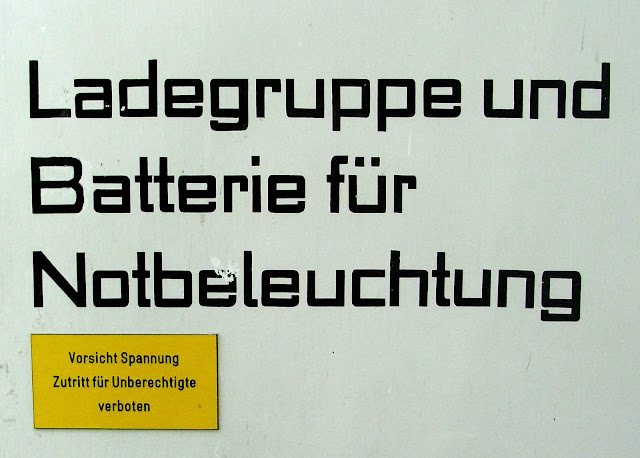


I amused myself by pulling together several similar modernist alphabets — mostly from the 1920s and mostly from Germany. The Nazis said these letter-forms looked immoral.
One startling discovery everybody makes when they start looking into the history of printing is how common it is for people to attribute deliberate immorality and wickedness to any style of type that departs from contemporary custom.